Askable initially started as a recruitment platform to help UX researchers and designers find participants for user testing. However, they aimed to expand beyond recruitment to support the entire UX research process. This led to the launch of Askable Sessions.
In 2023, Askable Sessions aimed to enable customers to extract data from interviews and share those insights with stakeholders.
As the product designer for Askable Sessions, I developed a method for customers to analyse and synthesise their interviews. This process allows them to easily add highlights as evidence when creating insight reports to share with stakeholders.
Askable
Product Designer
4 months
Research
Interaction Design
Visual Design
Prototyping
With the launch of Sessions video interviewing tool and Playback, customers could easily conduct and rewatch their user interviews. However, when it came to extracting data to identify common themes as part of the research process, they had to migrate the videos to other tools due to the lack of such functionality on Askable.
Enable researchers to create highlights from interviews, organise them as needed, and add them to an insight report as supportive evidence.
During this mission, our team decided to split into two squads. One squad focused on designing and developing the report document builder, while the other squad, including myself, focused on the highlights, tags, and reels features. In the next section, I will detail the final solutions and then discuss the research, design exploration, and collaboration processes that led to these outcomes.
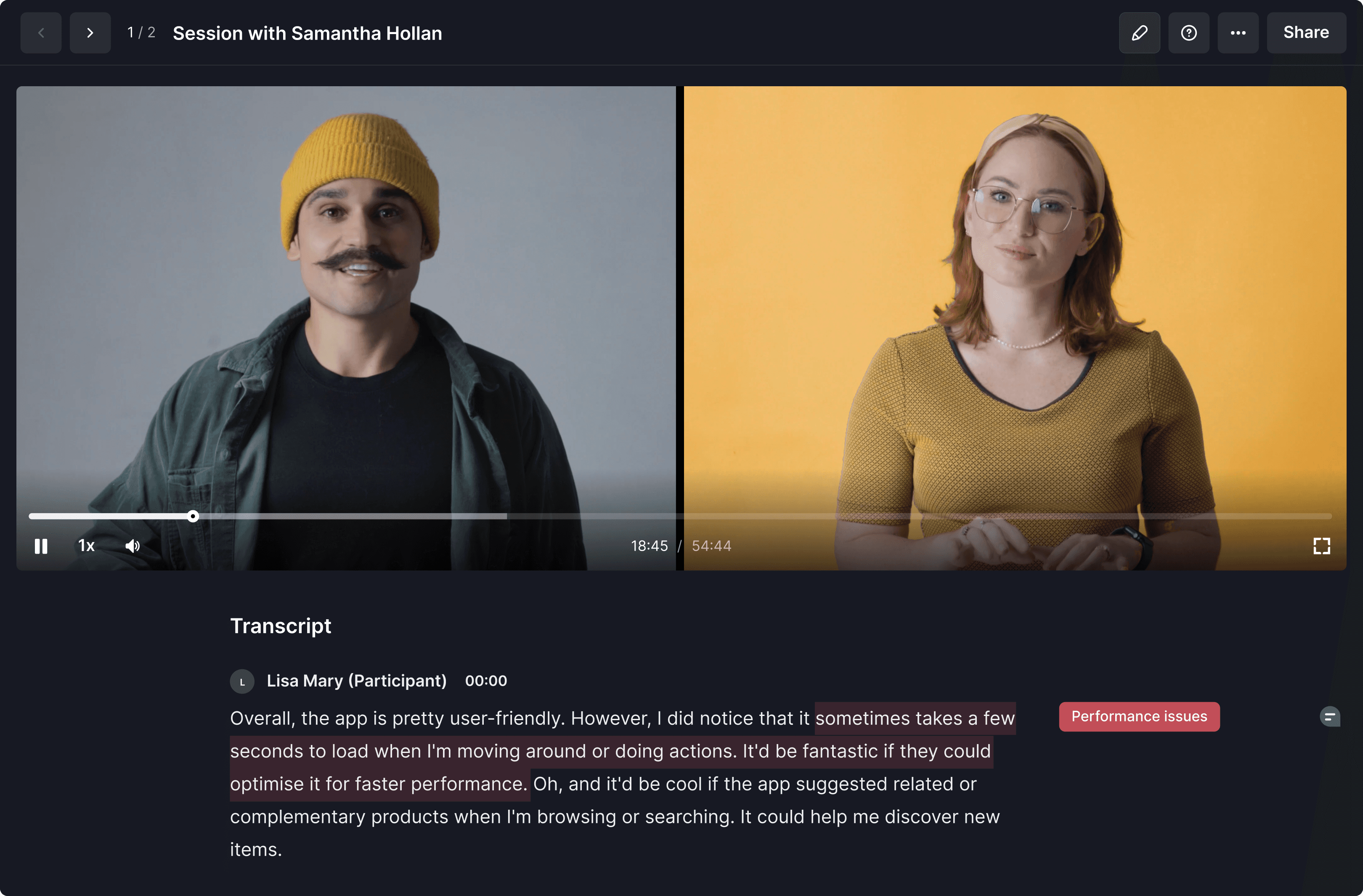
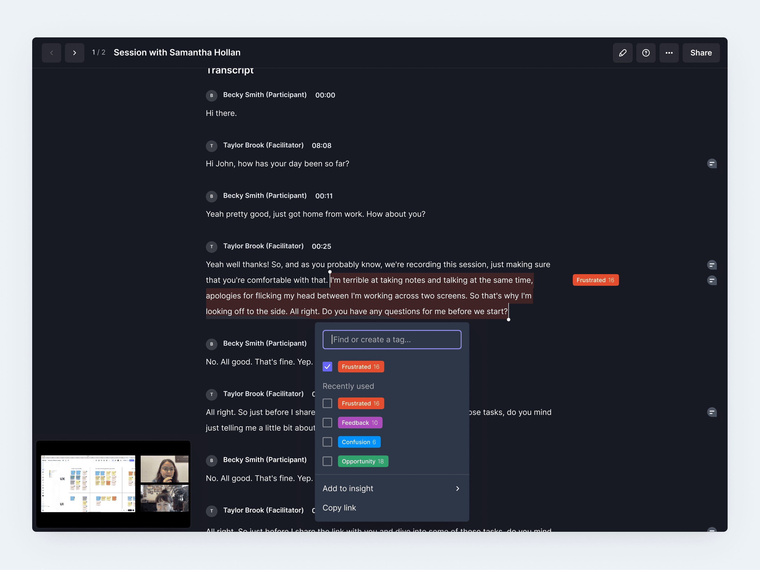
While working on this project, I conducted multiple continuous discovery interviews with customers to understand their research processes. I learned that many researchers primarily used transcripts to analyse and synthesise data from user interviews. After several design iterations, I focused on allowing customers to easily highlight important sections of the transcript and tag them as needed to organise common quotes together.
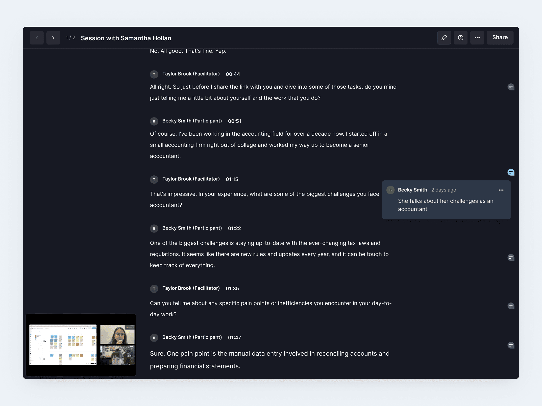
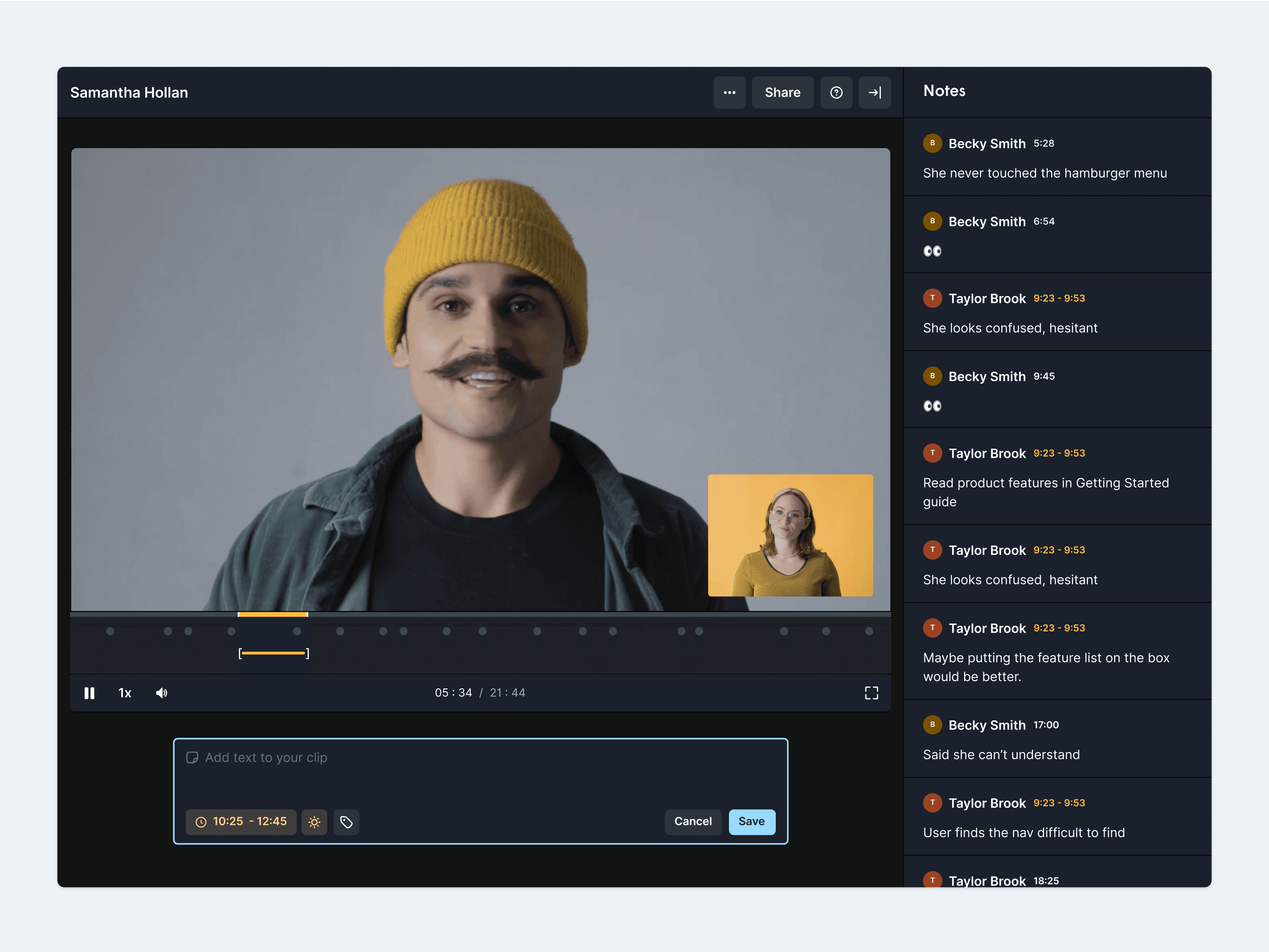
In my designs, I needed to find a way to visually display notes taken during the call by both researchers and observers. I decided to place the notes alongside the transcript, based on their timestamps. This allowed customers to easily locate notes within the transcript according to when they were taken during the call.
In collaboration with my lead product designer, I worked with the other squad to design the insights report builder. Within this scope, my focus was on how customers could search for and add relevant highlights to the report. To accomplish this, I designed a panel that allows easy searching, filtering, and adding of the necessary highlights to the report.
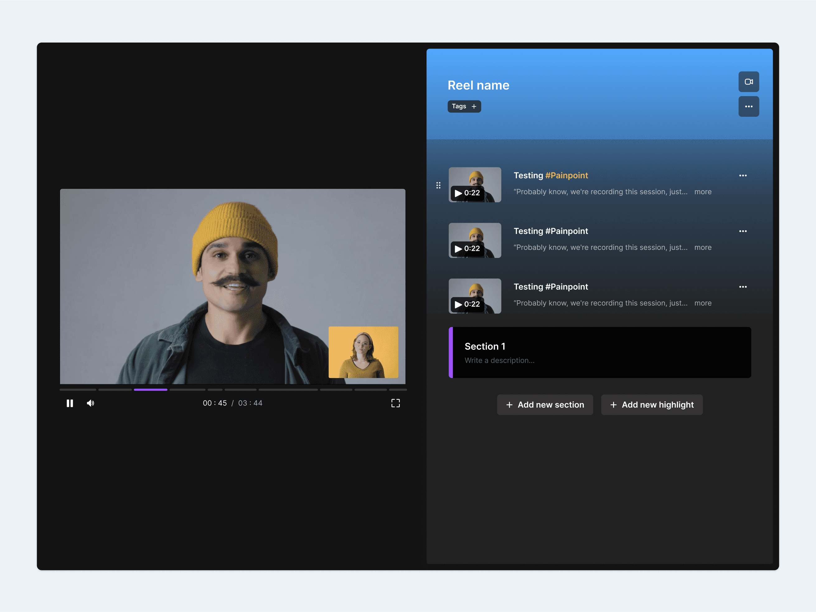
Through my research, I found that customers wanted a way to combine multiple highlights to tell a cohesive story in support of an insight. Here, I designed a way for customers to create a highlight reel, edit it as needed, and add it to the report to support an insight.
To manage the tags created from highlights, we released a tags management page. Here, customers could edit, add, search, delete, and merge tags as needed. We also introduced tag descriptions to provide additional context for tags, making it easier for other team members to understand and use them effectively.
Towards the end of 2023, with the help of the new Askable Session features, Askable Plus projects grew by 223% compared to 2022. This growth was driven by the ability for customers to maintain a digital repository of all their project insights, created by Askable Plus researchers.
Throughout the entire project, I conducted 1-3 continuous discovery interviews each week. This allowed me to explore the problem space and understand how UX researchers and designers analyse and synthesise their work, enabling me to make design decisions based on real evidence rather than assumptions. Here are a few key opportunities I discovered:
A significant portion of researchers' time is spent analysing and synthesising interviews, compared to conducting moderated research. The current process is very manual and time-consuming.
Whether they are using a canvas tool like Miro, or transcription tools like Dovetail, researchers have specific criteria they are looking for and utilise tags or a codebook to organise their findings.
Once I had my research insights, I started exploring potential concepts for solutions. One idea was to create highlights directly from the video. However, after testing this idea, several usability issues emerged. I quickly learned that customers preferred using transcripts to find relevant quotes rather than the video itself. Based on this feedback, I decided to prioritise using the transcript as the primary method for creating highlights.
Another idea I explored was having highlight reels as a standalone feature, enabling customers to create, edit, and share reels independently. However, after testing this idea, I found that reels are only truly powerful when they support an insight. Therefore, I decided to pivot away from having reels as a standalone feature and instead incorporate them into the insight report.
Based on my continuous discovery interviews, I wanted to explore an idea that would utilise AI to streamline the process. I came up with the concept of using AI to automatically turn notes taken during the interview into highlights. However, after testing this idea, I found that customers use notes in many different ways, and having notes automatically become highlights could be quite disruptive in the long run. Because of this, the team and I decided to keep notes and highlights separate and consider integrating AI as a separate feature to be released in the future.
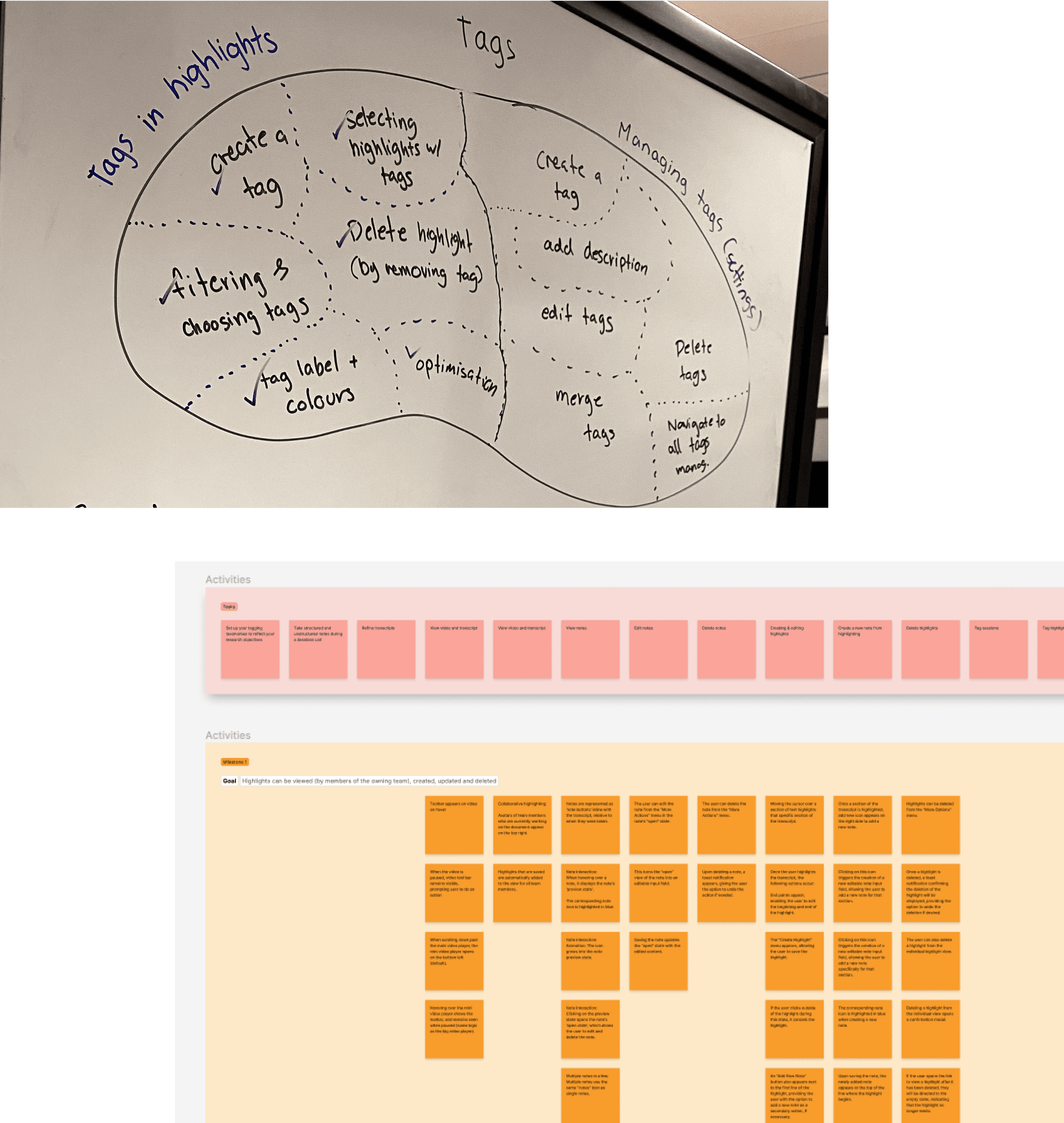
Once I had a clear idea of the design direction, I created a task flow to consider all potential scenarios and use cases. Then, I started designing the flows and prototypes in Figma, including annotations and notes for developers.
At Askable, we don’t have product managers, so the designer typically takes on this role. For this project, I ran a story map session with my development team to scope out the different releases. This collaborative approach helped us decide what to focus on to remain lean while still delivering a complete experience.
After the session, I set up the tickets on Linear with the necessary designs and worked closely with the developers during the build, reviewing their work and collaborating throughout the process.
The power of discovery
Through this project, I learned the power of discovery. Having weekly conversations with customers helped me design solutions that were closer to reality and truly addressed their problems, rather than relying on my own assumptions.
Go wide then narrow your focus
In this project, I explored different ways of solving the problem and tested various solutions to see which one would work best. I learned the value of starting a project by generating as many ideas as possible. Often, the best ideas emerge when many ideas are generated.
Be a leader and collaborate
To ensure the project was completed on time, I worked with multiple developers on different parts of the project simultaneously. This required me to support them not only with design requests and reviews but also by managing scope, tickets, and delivery. This experience allowed me to hone my skills in both collaboration and leadership when working with engineers.
