Dragonfish is a culture and performance consultancy that aims to help it’s clients to perform to the best of their capability. Together we designed a performance tracking tool that allows clients to send pulse surveys to gather data about a company’s culture.
My primary responsibilities were verifying the product's need in the market and working with the team to design its end-to-end UX/UI experience.
Company
JB/UXD
Role
UX/UI Designer
Timeline
4 months
Responsibilities
Research
Facilitation
UX/UI design
Visual Design
Prototyping
For over a decade, Dragonfish has won multiple awards as a global culture and performance consultancy, helping businesses better understand their company culture and as a result drive sustainable growth.
They were looking for a new way to optimise their tedious process of manually sending pulse surveys and generating reports for their clients.
Design & build a web app that efficiently tracks the culture performance of Dragonfish’s clients, thereby replacing the dependency on tools like Survey Monkey.
Use the Design Sprint to scope the first big release of the web app, prioritising the functionality and features Users value most
Build the end-to-end journey of the first release of the Minimal Viable Product (MVP)
During this project, we ran two design sprints in four weeks. The first two weeks focused on aligning the vision and testing the viability of our solution. The second two weeks focused on iterating our designs based on our learnings and developing a product report for Dragonfish to gain funding.
After verifying the need for the product in the market, Dragonfish was able to raise capital to build the MVP web app. After a few months, we came back together and started fleshing out the entire journey.
Workshop
Workshop
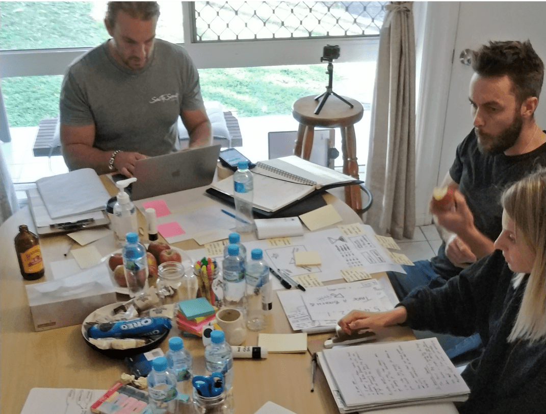
Once we knew what problem to focus on, we started the solution workshop. Here we used methods such as Lightning Demo Research, note taking, doodling and crazy 8’s to help everyone get their ideas onto paper. We then voted on the best solution components and brought them together in a storyboard creating a rough draft of our user journey.
This was where we realised that instead of improving just one component of the process, we could create a product that would solve multiple problems the company faced at the same time, such as:
• Allowing customers to send out pulse surveys without having to involve dragonfish employees in doing so.
• Generate automatic reports so users can download and see their score against the benchmark.
• Receive recommendations on how to improve their score based on their data.
• See their improvements over time in each category: company performance, customer alignment, brand alignment, emotional commitment & job satisfaction.
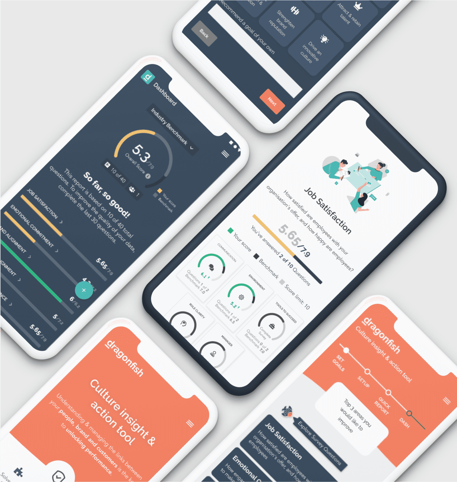
We decided to focus on designing the free version of the web app for user interviews and to see if it enticed users enough for them to register. From this, I started wireframing the initial screens of the journey. I also started designing the benchmarking dashboard for users to view their overall scores after the initial survey.
After wireframing, I designed the screens as high-fidelity as possible, allowing users to imagine this as a live product during the interview.
We tested our solution with 11 people in senior HR and change management roles, all from various large organisations. Here we found the following top insights:
Users were doubtful of the credibility of some of the questions chosen.
Users found value in the performance checklist, but found it overwhelming.
On the pricing pages, users wanted to explore the individual features.
Once we iterated our designs based on what we learned from testing, we prepared the final prototype, report and presentation for Dragonfish to receive funding for the product.
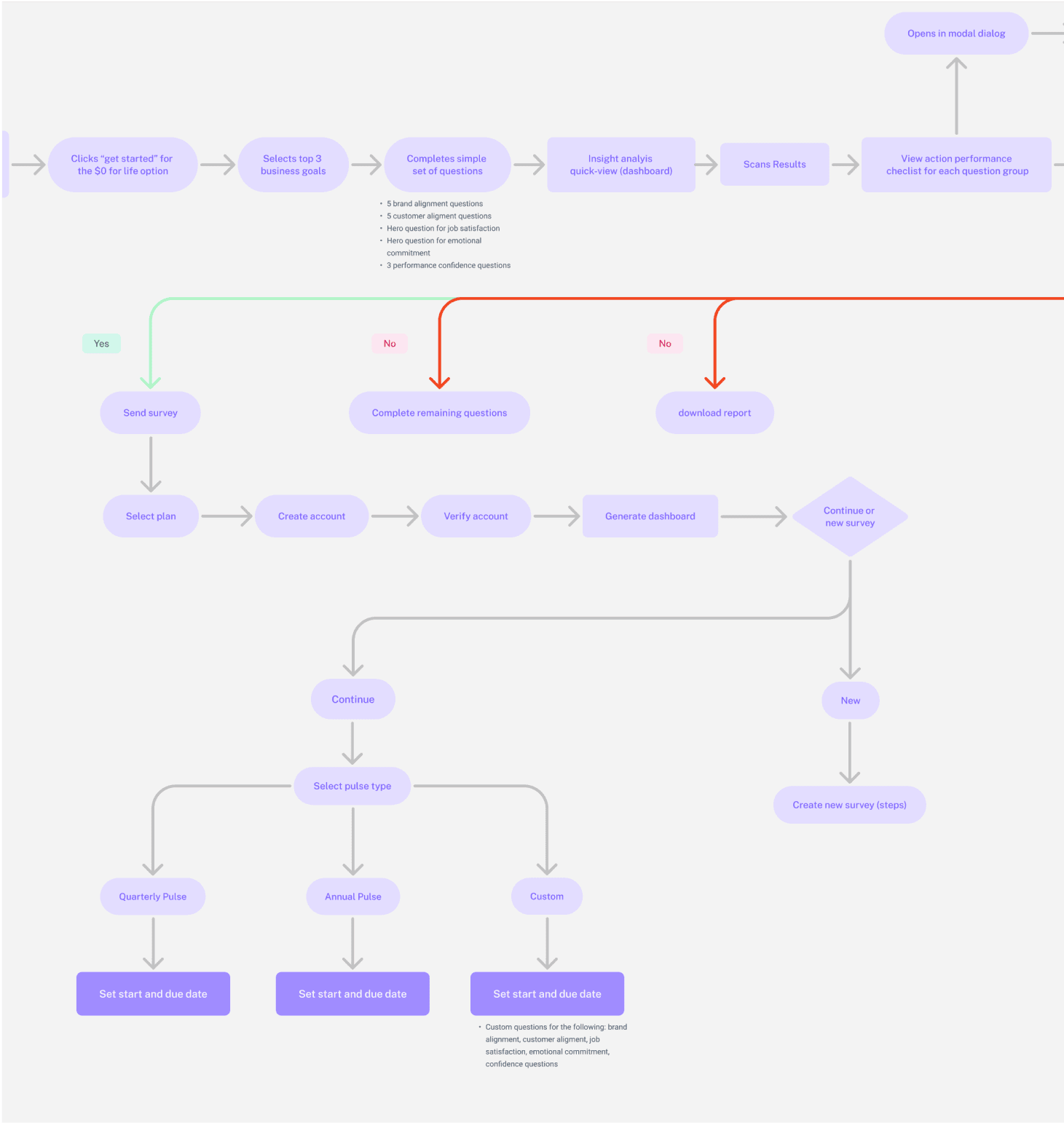
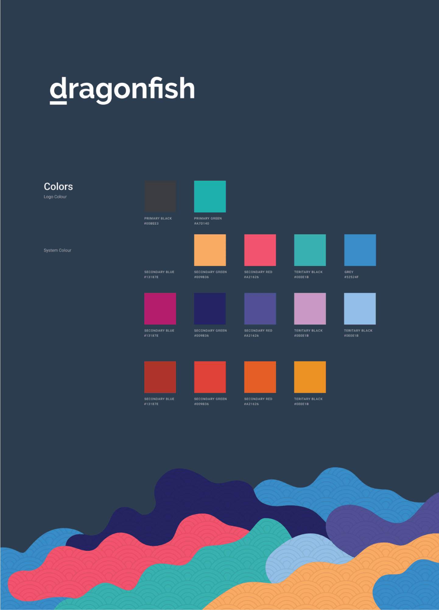
A few months later, we came back together with the task of building out the entire journey for development. Here I worked on fleshing out the task flow and on building the design system.
Workshop
Once we had the design system, I revisited our designs and started building out the other journeys. Here I worked on applying the many insights from testing and adding them to their respective screens to make sure I was designing for the right problems our users were facing.
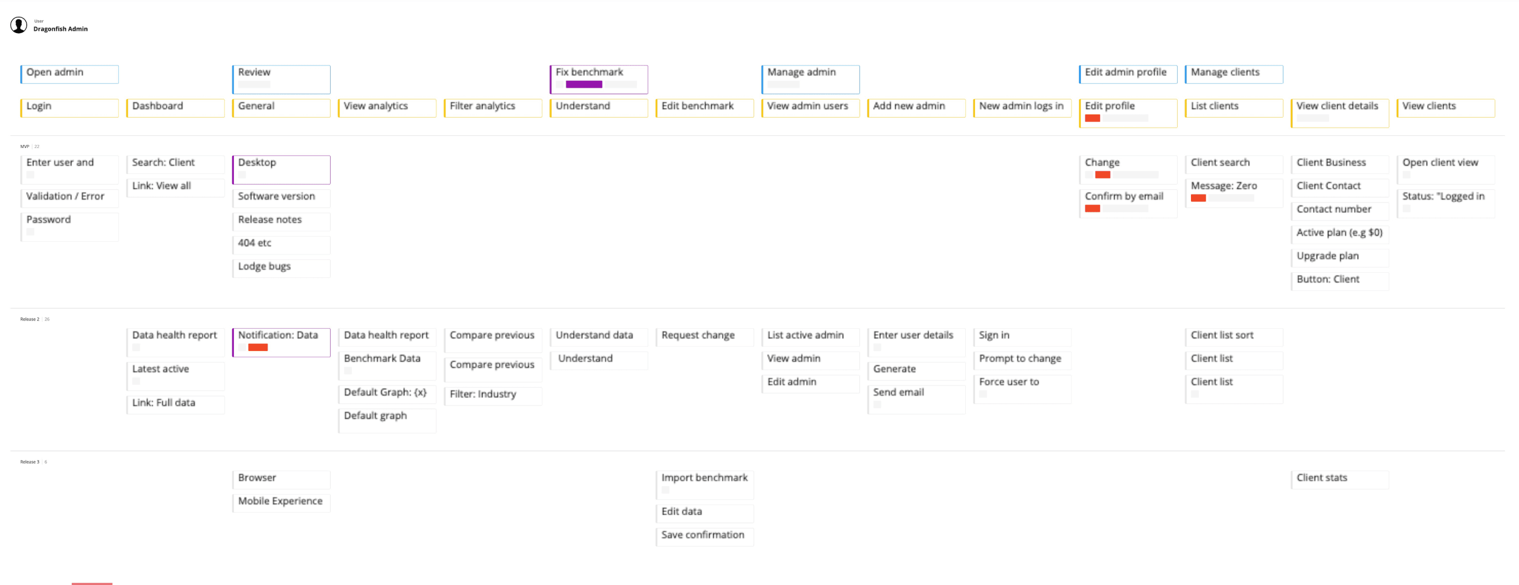
Once the designs were finished, we worked on creating a story map to help prioritise the features we wanted to focus on during the first MVP release. This would help Dragonfish and the developers know what features to prioritise and what could be developed later.
To help with the development process, we used components from Propeller, a front-end framework based on material design. When handing over the work I created a document to help our developers know what components, assets and styles we used.
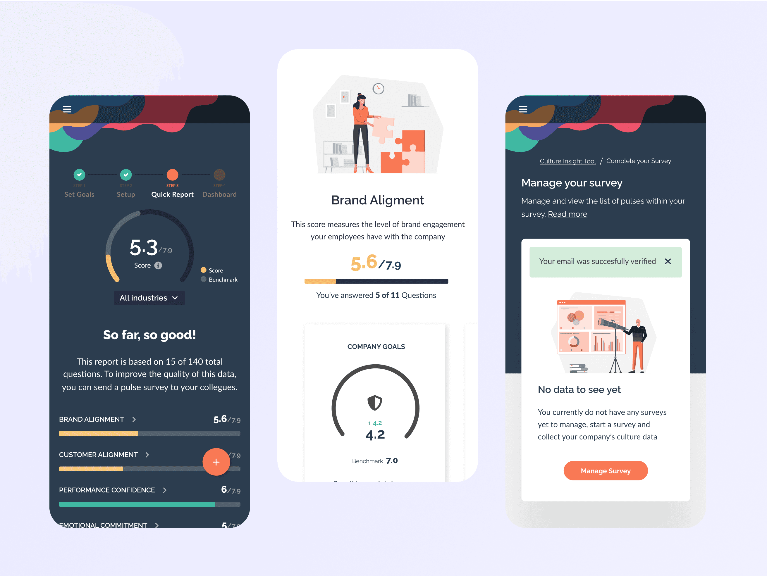
Designed a free survey that new users can use to set their goals, answer questions and view their score against the benchmark, all before registering
Users can then see their benchmark dashboard showing what areas they can improve and recommendations on how to do so. They are then asked to register.
Once registered, they can configure their pulse survey, customising areas such as question sets, custom questions and enabling advanced reporting.
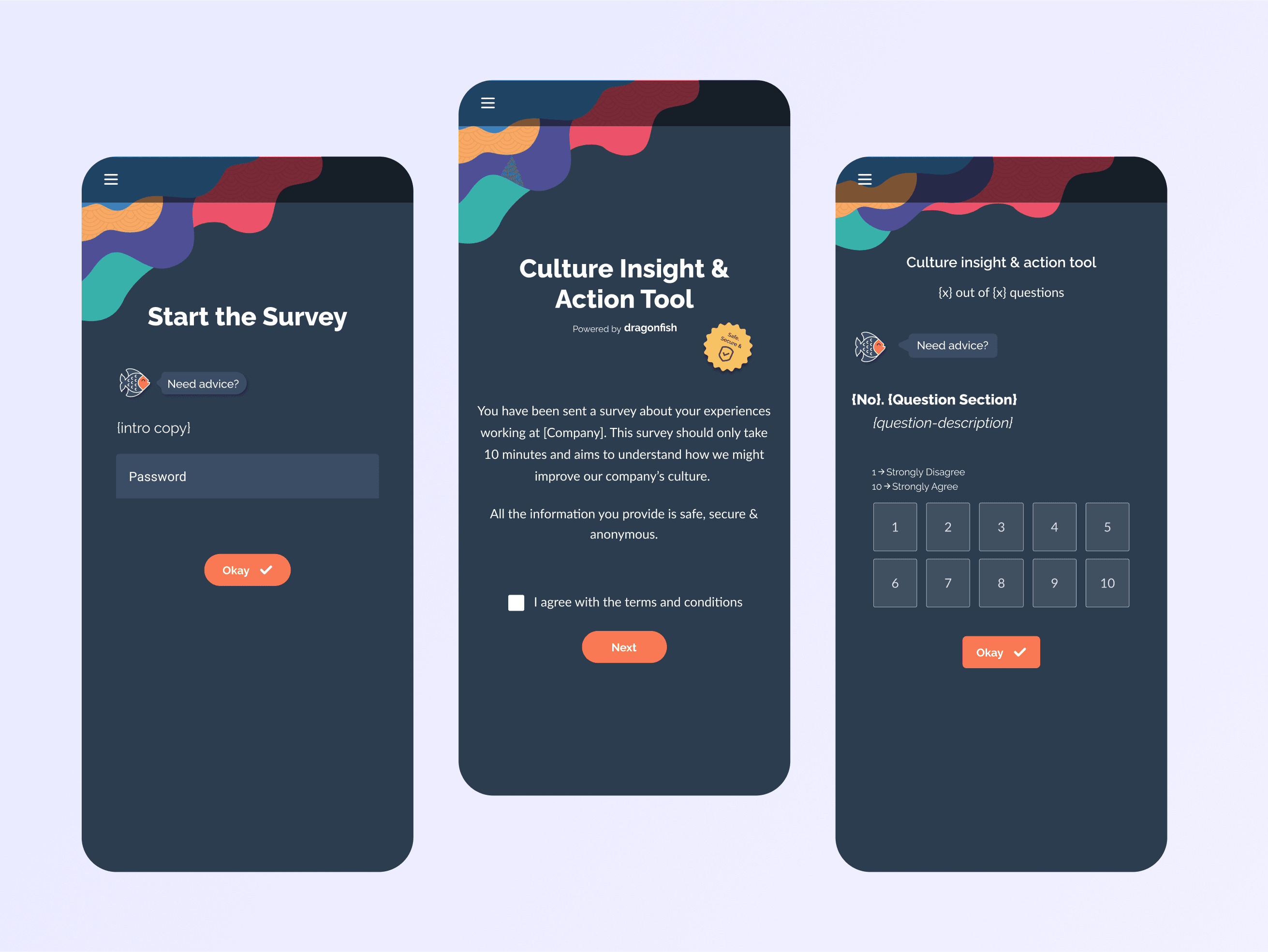
I also designed an employee's survey journey when they receive the pulse survey from their company.
This was an exciting project as I was involved in verifying the need for the product in the market and was responsible for building the entire end-to-end experience. However, shifting priorities and changes in the roadmaps did delay Dragonfish's product launch. Still, I learned some important key takeaways from this project related to product and business.
Asynchronous work setting
Dragonfish was the first project I worked on during the pandemic. Because of this, all workshops, meetings, user interviews, and design reviews needed to be done remotely. This taught me the power of a process and using the right tools to align people to work collaboratively, especially within a changing environment.
Choosing what we won't do
We wanted to include many features in the first release; however, I learned how to define a true MVP during this project. I needed to narrow my focus to solving the right problems that would yield the most impact. This meant, at times, removing unessential features.
Don't create problems from the get-go
Another big thing I learned during this project is not to create problems from the get-go and to look at design decisions from a development perspective. This allowed me to be more conscious of design decisions so issues won't arise later in the process.


