Today's children have grown up with a vast array of electronic devices at their fingertips, so parents must find new ways to limit their children's screen time. ScreenCoach aims to solve this problem by supporting parents in regulating and rewarding their child’s screen usage.
My primary responsibility was to design an onboarding experience that allows ScreenCoach users to understand how to connect their children's devices to the app and use the main features that ScreenCoach provides.
Company
Jb/uxd
Role
UX/UI Designer
Timeline
2 months
Responsibilities
Research
Facilitation
UX/UI design
Visual Design
Prototyping
ScreenCoach users were dropping out of the application early in the journey because they found the application too complicated to use.
How might we design an onboarding journey that allows users to trust and use ScreenCoach in their daily lives?
Use the design sprint to test the viability of the new onboarding experience.
Design an onboarding experience that allows users to connect devices to ScreenCoach and help parents understand the rewards systems of the app.
We ran two design sprints to focus our understanding of the problem and build a solution to test with real users. Once we had our findings from testing, we moved into a bespoke design process, allowing us to expand our scope and design an in-depth onboarding journey.
Workshop
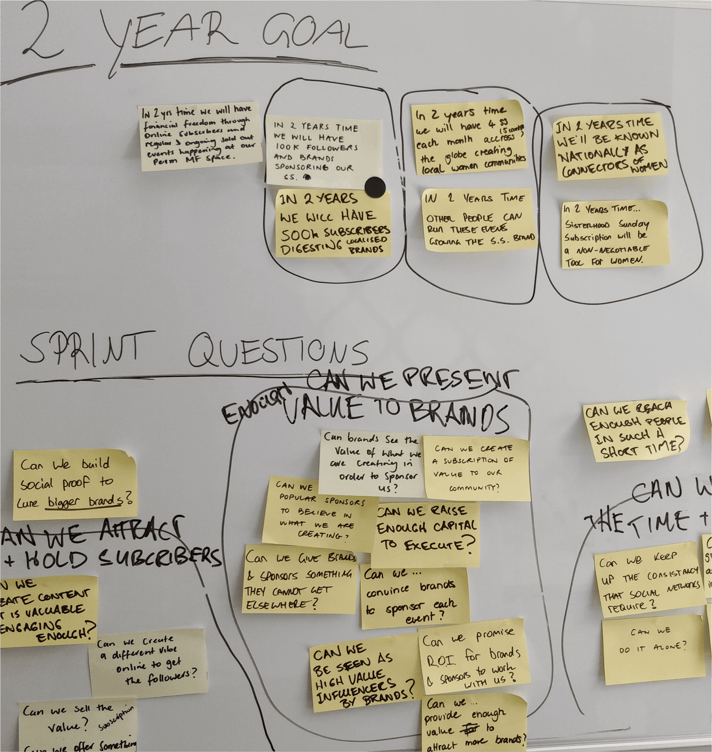
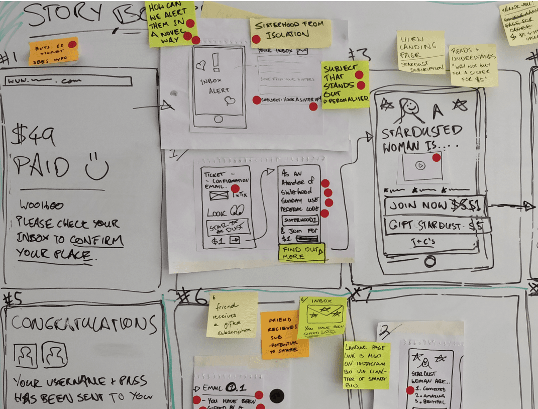
We started the design sprint with an alignment workshop which focused on getting everyone to agree on what problem we wanted to solve. We created a customer journey map and learned that ScreenCoach had difficulty retaining users during the beginning of the experience. Because of this, we decided to focus on designing an onboarding journey to help users get started with ScreenCoach.
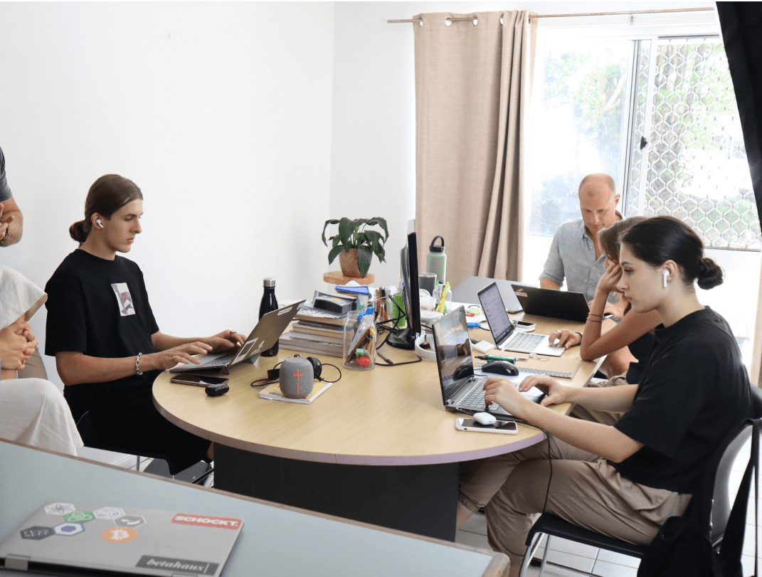
During this phase, I was responsible for co-facilitating the workshop. This was a difficult part of the process, as the ScreenCoach team had many internal differences, making it hard to align during the workshop. This challenged my skills in facilitation, such as handling conflict and managing expectations. But together with Jackson, the lead facilitator, we were able to bring the team together and align everyone’s focus together.
Workshop
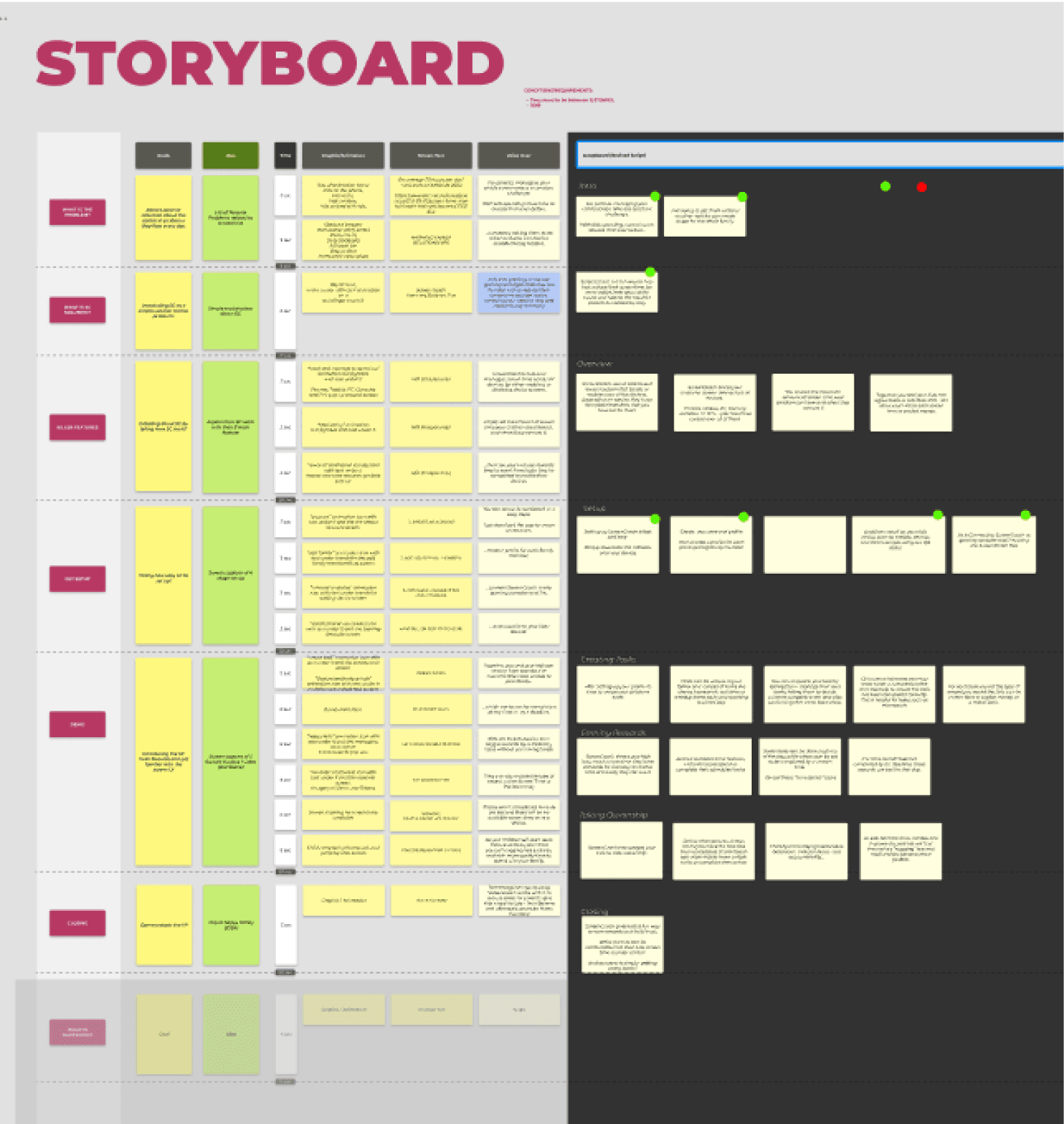
Once we knew what we wanted to achieve, we ran a Lightning Demo to research what other products are doing to solve the same problem. We then used note taking, doodling and crazy 8’s methods to help ideate different solutions. Here we found that everyone was interested in creating a gamified onboarding journey, involving both the parent and the child in the experience.
Our solution aimed to design for the following:
• Designing a fun, gamified onboarding experience that explains the core features of the application while introducing the screen time reward system
• Help parents connect and set up child’s devices to their phones.
• Help parents set up primary and advanced activities for their children.
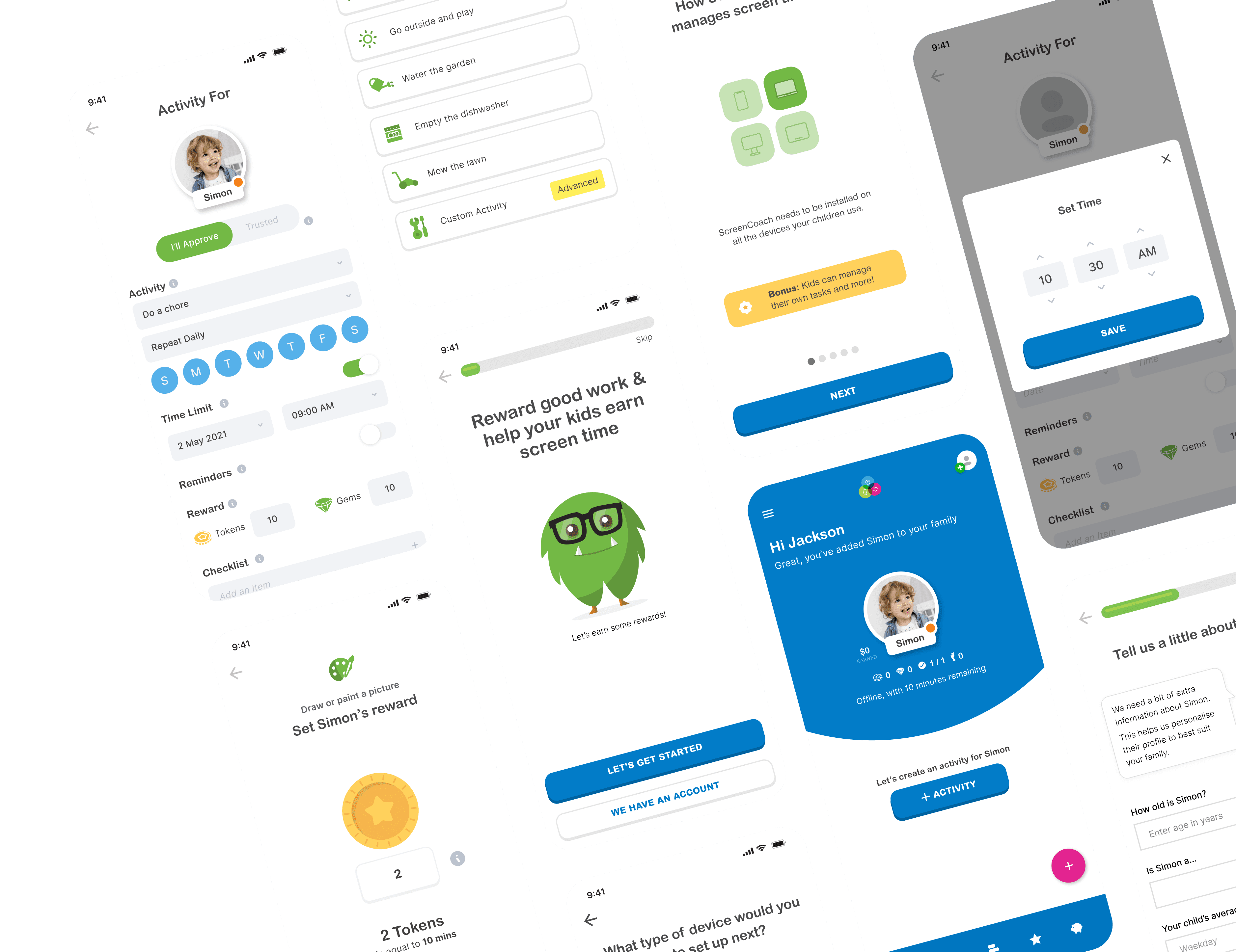
From the concepts, I started designing the wireframes and the high-fidelity screens. I first focused on creating the initial onboarding experience, which users will go through once they register. This was the experience we used for testing.
We then tested our solution with 11 users between the ages of 30 to 45 and with at least one child from the ages of 8-12 who spends too much time on their screens. Here we found the following top insights:
Didn’t understand the conversion rates of Tokens to Screen Time
Questions regarding conversion between tokens and screen time were raised by users, for example, “how much is two tokens worth in screen time?” Some users also wanted to be able to customise the conversion between tokens and screen time.
Interest in creating advanced customised tasks that would be specific to their scenarios
The general feedback was to align these actions to the insight categories. E.g., “5 ways to improve Job Satisfaction”, opening a list of actions appropriate to the function.
Preferred converting the tokens into screen time rather than pocket money
ScreenCoach had a feature of converting tokens into pocket money and wanted to test the viability of this feature. While users found this interesting they had a lot of questions concerning how it would work and preferred to use the application solely for screentime.
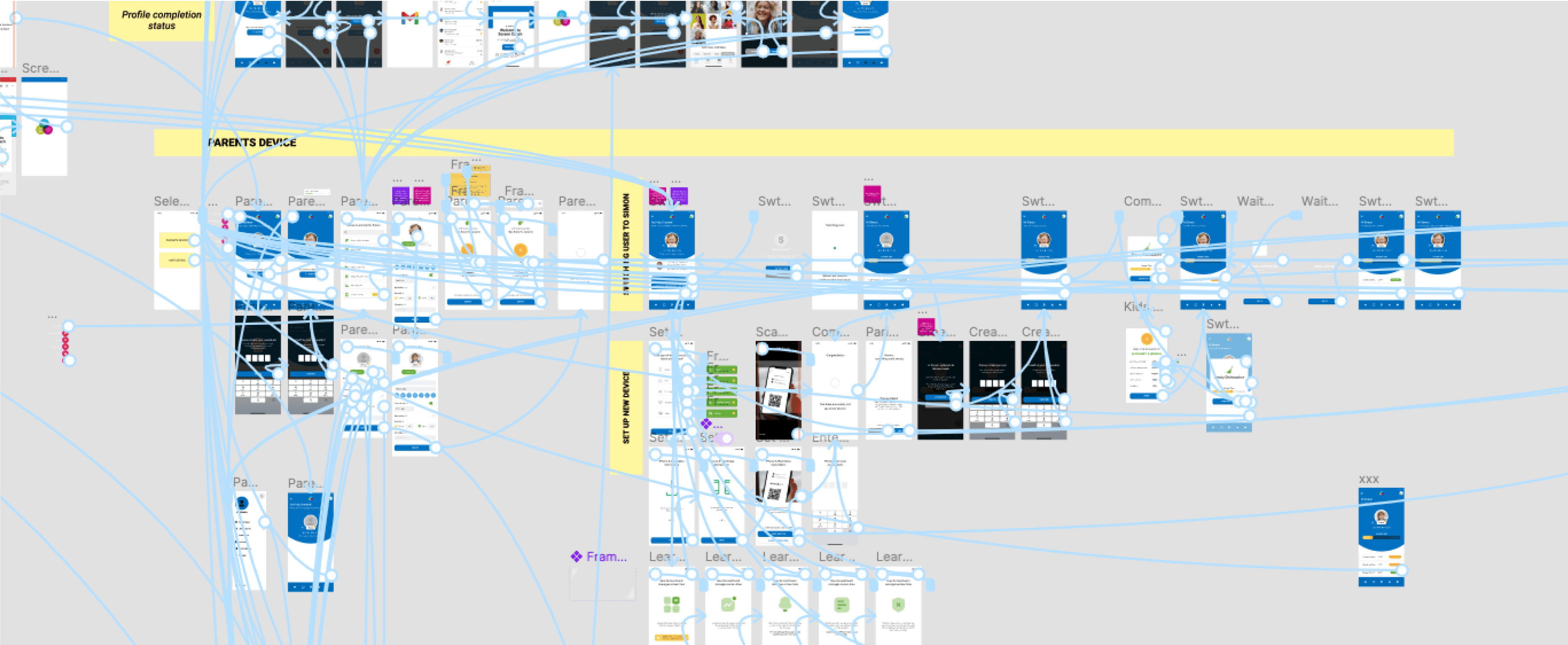
After testing, we started the bespoke design process with ScreenCoach to apply the insights we learned from testing to build out the other journeys within the onboarding experience. This allowed us to have a quick back and forth with ScreenCoach stakeholders and design collaboratively.
Here I focused on iterating my designs for the initial onboarding experience after registering and started finalising the child device in-app set-up experience, the parent’s activity set-up experience, and the advance activity set-up experience.
I also started creating the design systems for the platform, integrating ScreenCoach's old design elements while creating new components, colours, iconography and assets.
Once the designs were completed and signed off to move into development, I worked on creating a handover document that included the design systems, spacing, assets and details instructions.
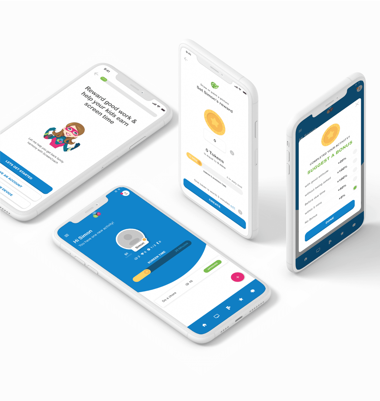
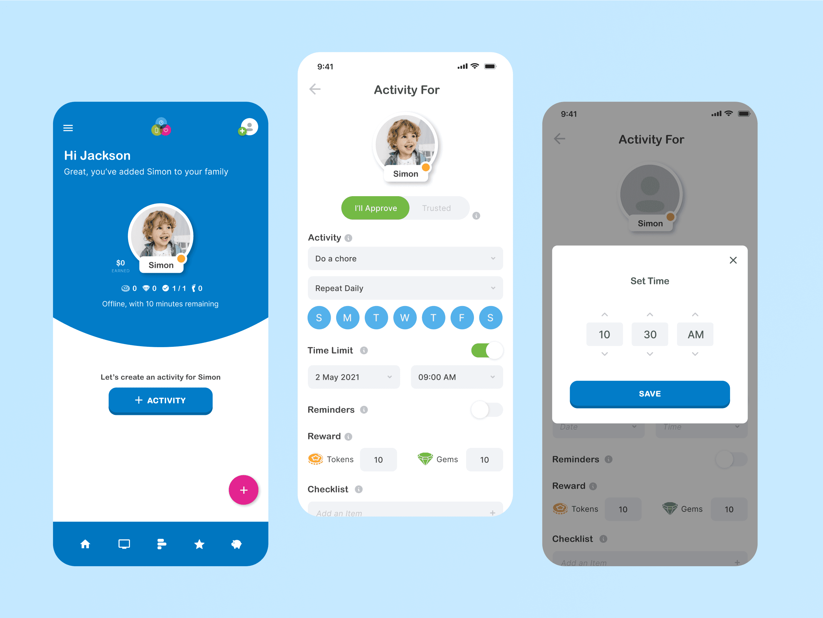
After downloading the app users can now create an account and set up an activity for their child, and once their child completes the activity they are awarded their first token which they can convert into screen time
Once they receive their first token they can now view their dashboard. In their dashboard they will receive a notification with guided instructions on how to connect their child’s device to their profile.
Once they have set up their child’s device they can now set all activities for their child to complete. .
During testing we found that a lot of users were very interested in setting up customised activities. We designed the journey to allow users to set-up custom activities based on their scenario.
I enjoyed designing an onboarding experience that would be fun for both children and parents. I also learned a lot about stakeholder management and being able to adjust a design process to achieve the results needed.
Adjust the process as needed
During the project, we realised the design sprint wasn't achieving the goals we wanted. Because of this, we moved to a more bespoke design process, allowing us to work faster while collaborating with the client. This taught me that a design process can always be mended and adjusted depending on the project's goals.
Always fight for good UX
There were many moments when it was challenging to align the client's vision with what the design team believed needed to be done. Because of this, I learned how to manage client expectations while still fighting for what I believe is essential to achieve good user experience.
Don't overpromise and underdeliver
There were many significant use cases we could tackle with rich feature sets. However, a lot of these features were either costly or unrealistic. I had to determine where the real value was for ScreenCoach, so we did not spread ourselves too thin during the design and development phase.
