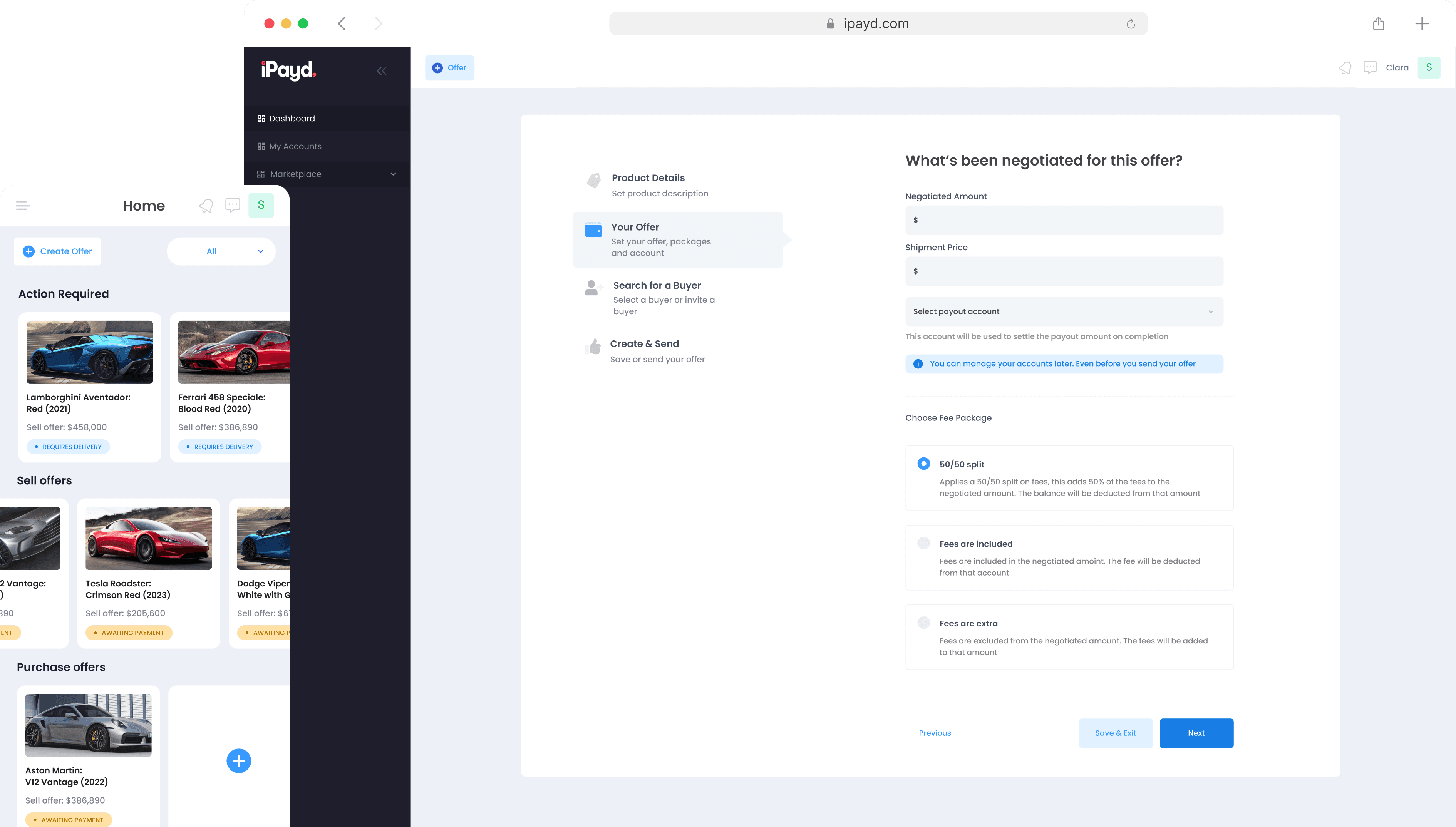
iPayd has developed a platform to process secure payments via a digital vault that aims to eliminate scamming on second-hand market spaces. Similar to escrow transactions when purchasing a property, buyers can be confident their money will be safe whilst waiting for goods to be delivered. Before the product launch, iPayd needed to improve its user experience by significantly reducing the complexity of the user flow within the platform.
My responsibilities for this project were to create a cognitive walkthrough of the software and conduct a heuristic review. After the heuristic review, I designed the user flow and prototype to minimise the platform’s user journey.
Company
Jb/uxd
Role
UX/UI Designer
Timeline
2 months
Responsibilities
Heuristic review
Research
UX/UI design
Prototyping
With no UX resource on the team, iPayd knew they needed to improve the platform's user experience before launch, as users were finding the experience too long and complicated.
How might we improve the UX/UI of the platform to reduce its complexity for users?
Specific goals:
Reduce the user flow by 50%
Conduct a heuristic review
User test our solution with real customers
Workshop
We started the process by running an alignment workshop with key stakeholders. Here we created an in-depth customer journey map and highlighted the key areas to focus on. The areas of priority are:
Primary: Selling & buying process (Red)
Secondary: Onboarding (blue)
Tertiary: Marketing funnel (purple)
For the project, we decided to focus our efforts on the selling & buying process for users and the onboarding process.
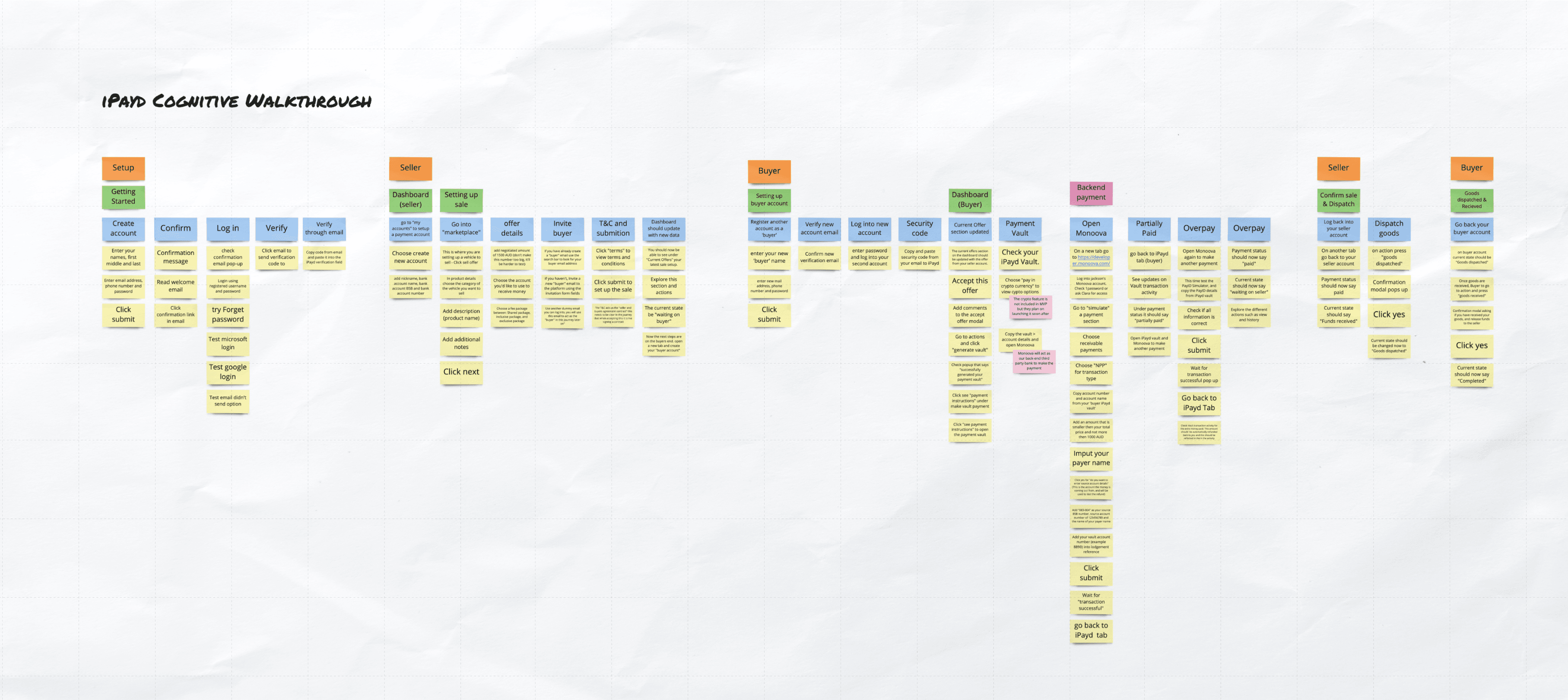
Before running the heuristic review, I prepared a cognitive walkthrough of the end-to-end journey for both the seller and buyer. This allowed my fellow evaluators to refer to this walkthrough when recording issues and so supported them in performing a heuristic review of the system.
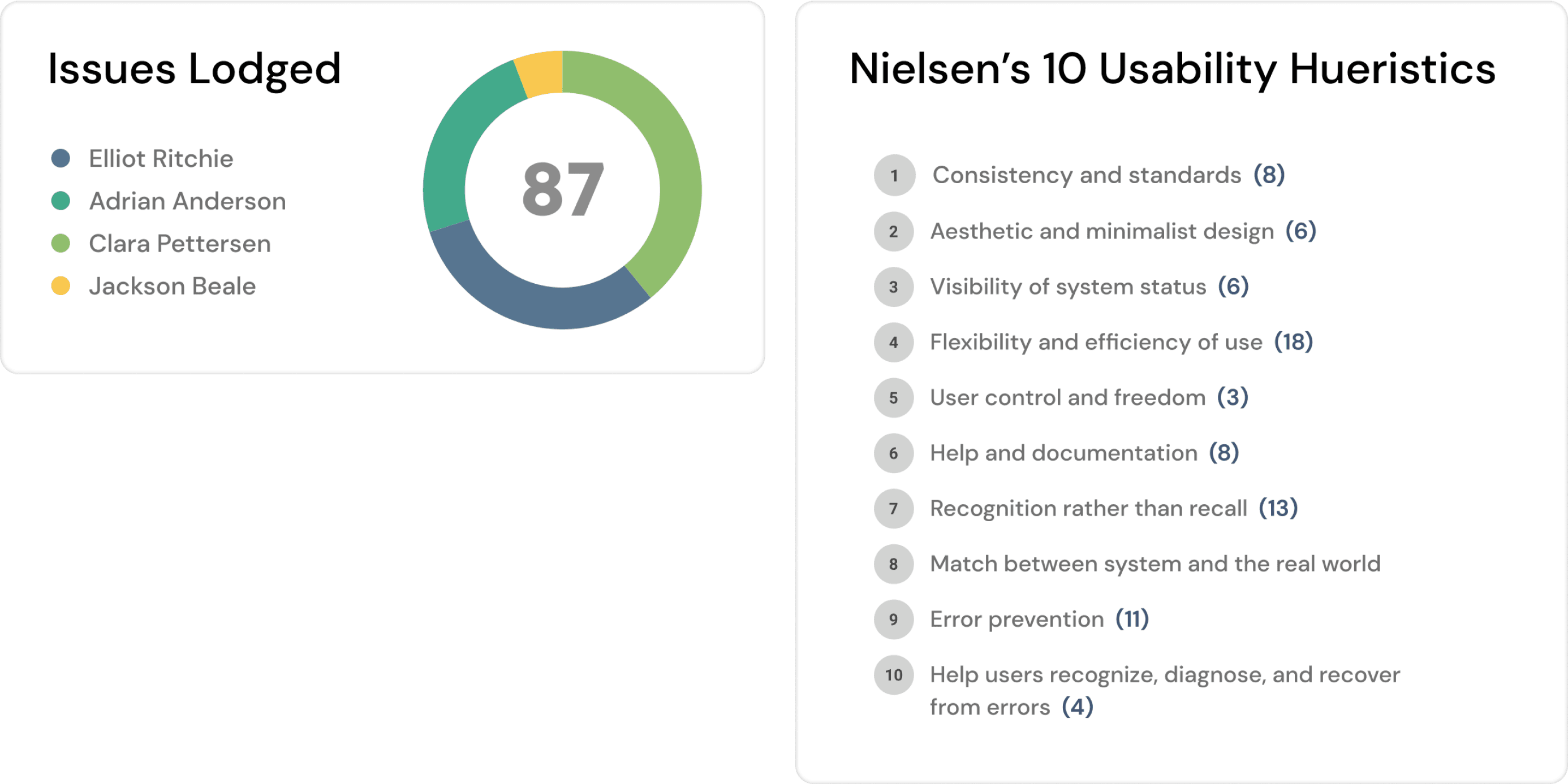
I evaluated the platform's interface against Nielsen's 10 Usability Heuristics along with two other designers to identify usability issues. Here we found a total of 87 issues.
However, we recommended focusing on the following problems in the short term to increase engagement, conversions and user satisfaction:
The platform's journey length:
• The recommendation is to reduce the friction to key goals for both users (the seller and buyer)
• Utilise email (or push) notifications to reduce steps
Mobile:
• Ties into the previous step
General UX/UI:
• Improve application language
During the alignment workshop, we learned that iPayd didn't have a dedicated UX design resource on the team. Because of this, the lead developer designed and built the product straight on code. To help with iterating and testing, I recreated 35+ screens of the existing iPayd application in Figma. These screens included reusable components, fonts and colours for consistency across all screens. This would allow the iPayd product team to test and iterate new designs on the prototype rather than the code itself.
Once I had designed the screens on Figma, I started reducing the buyer and seller's user journey. To minimise the user journey for both the buyer and seller, I did the following:
• Optimise the user onboarding experience
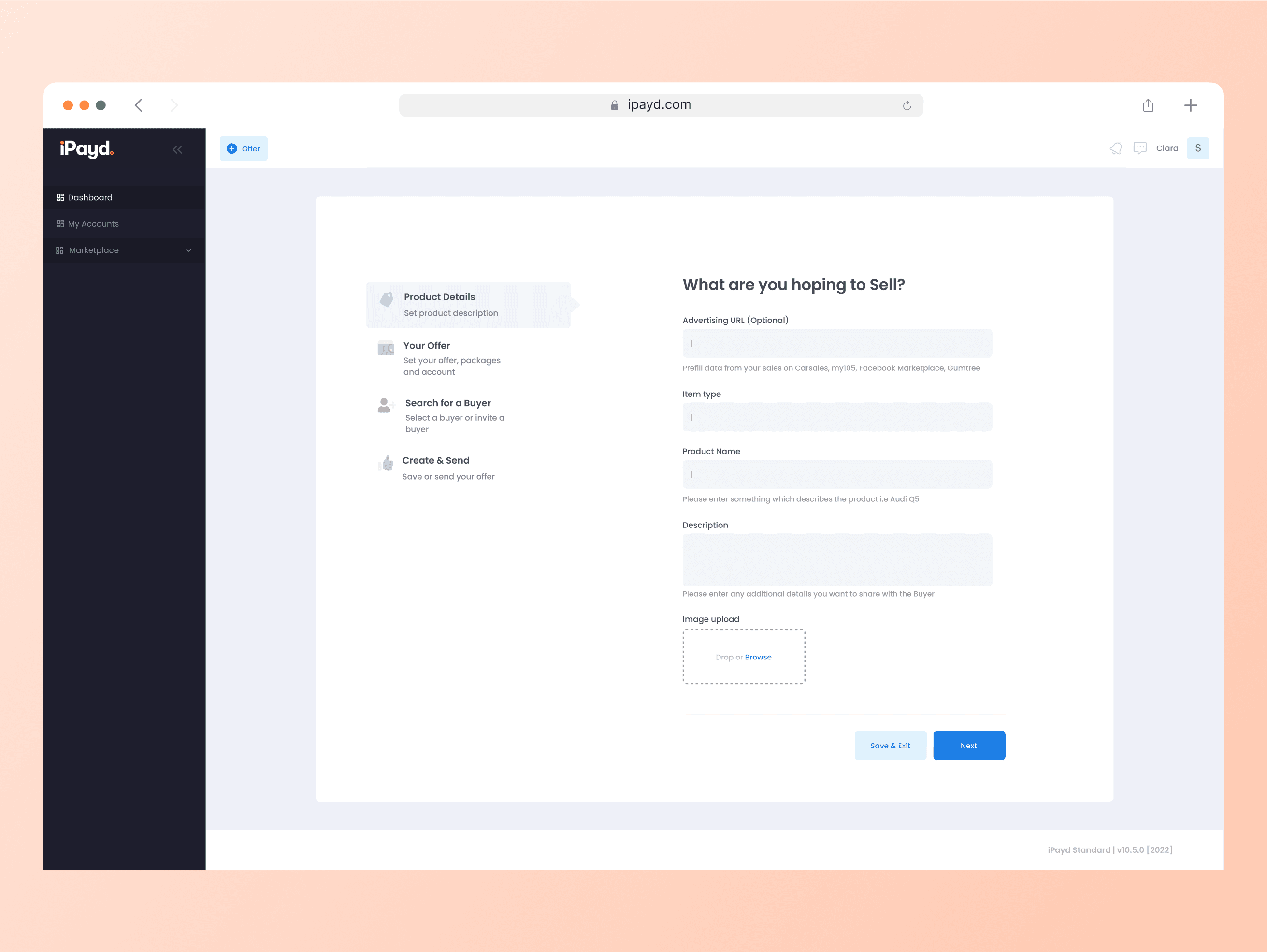
• Shortening transaction set up between buyer and seller
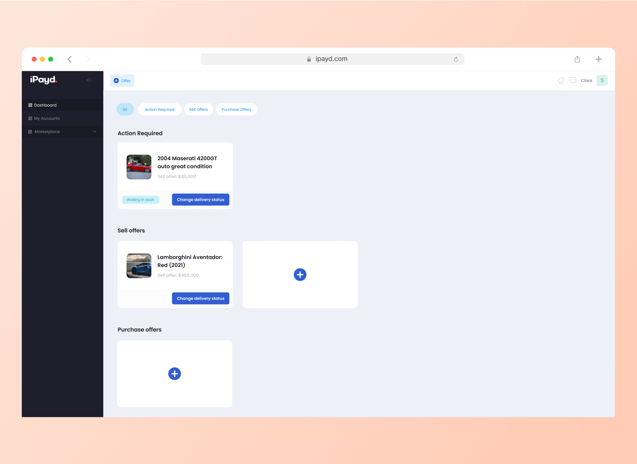
• Redesigned dashboard to create clearer action for users
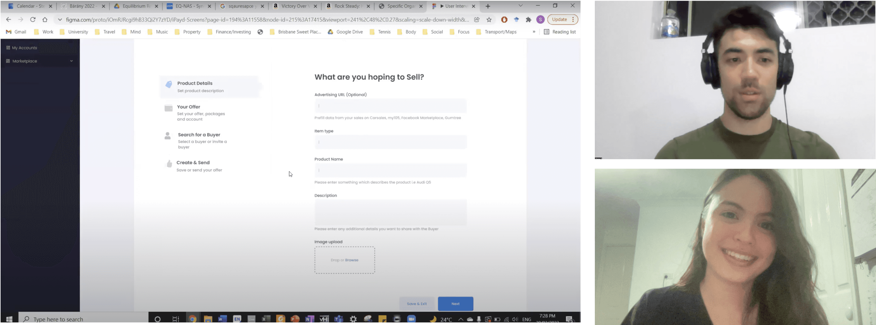
We tested our solution with three users who were all experienced in buying second-hand cars online, specifically in either the Facebook marketplace or Gumtree. They first went through the website to learn about the product and what value it had for them, and then they all went through the reduced user journey of the platform.
For this testing session, we specifically did not make a report of our insights. Instead, we asked everyone to watch the three user interviews to gather their insights, which we would bring to a workshop together.
Workshop
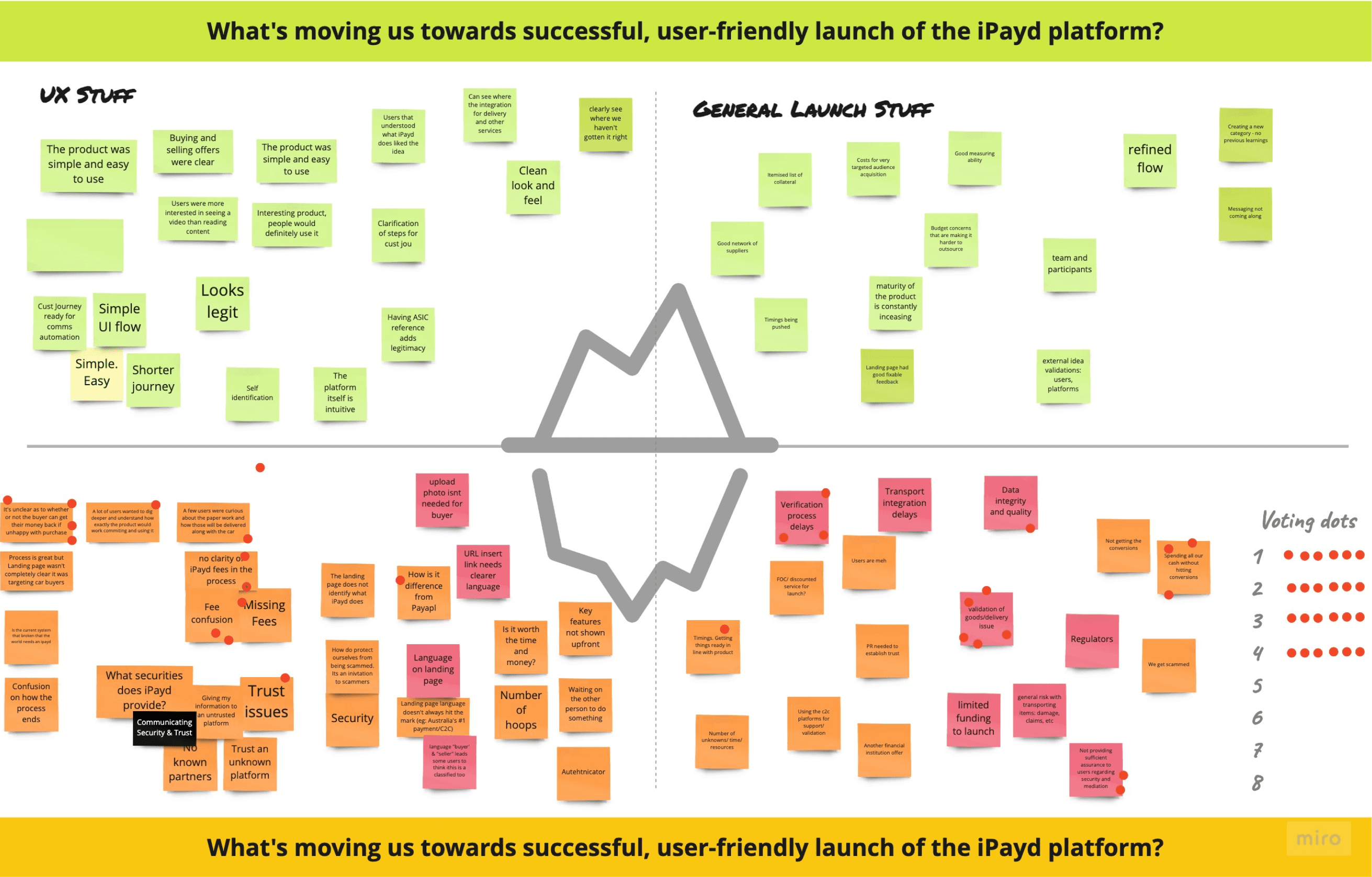
Once all the stakeholders watched the user interviews, we ran a retrospective workshop to see what everyone thought went well and didn't go well. My role here was to co-facilitate the workshop. I learned that everyone who watched the user interviews had different things that they found important. It was interesting to see what everyone wanted to prioritise moving forward.
Workshop
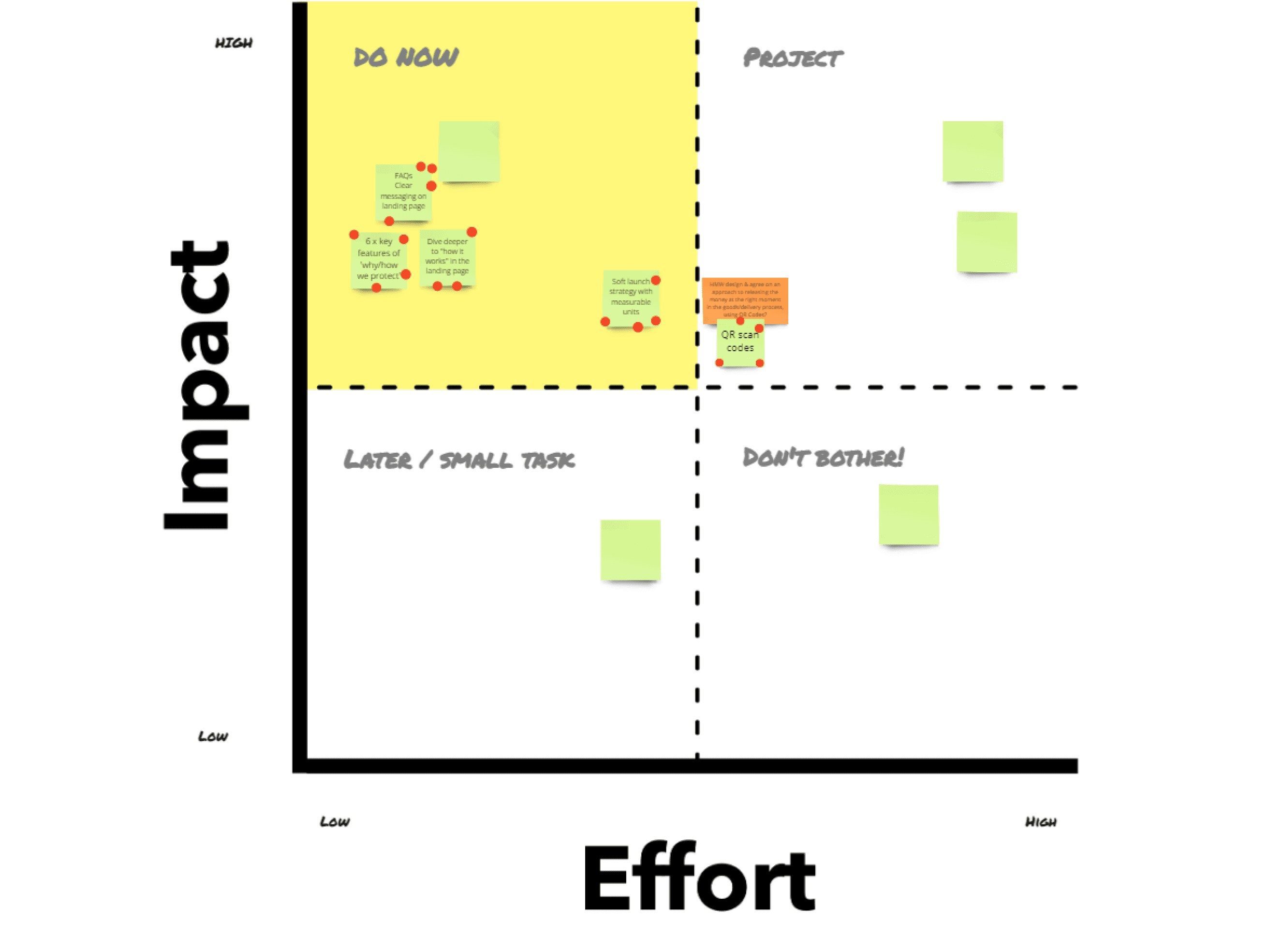
Once we had voted on the most critical problems to focus on, we turned these problems into "How might we" questions and brainstormed possible solutions. From these, we voted on the most valuable solutions and moved them into the effort and impact board.
Workshop
We then used the effort vs impact grid to decide what to execute. This allowed the team to prioritise based on what required the least effort but would produce the most significant impact.
One of the priorities when running this workshop was to teach the iPayd team how to run their own retrospective workshop, allowing them to use this method within their own team in future.
Once we iterated the designs based on what we learned from the retrospective workshop, I prepared the report documenting our entire process. I also prepared a handover document consisting of all the development design files.
One of the main issues we found during the heuristic review was that the experience of registering an account on the platform and logging in was very long and time-consuming. We shortened the journey by 50% and added clear CTAs to support users.
The original portfolio page designs did not achieve the goal of allowing users to determine what actions are required to complete the transaction. From this, we redesigned the portfolio page to show what products needed actions and what other products were in the user’s sell and purchase offers.
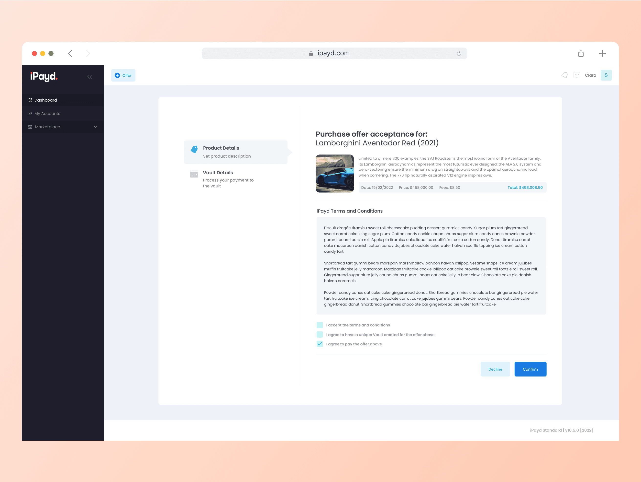
In the original designs, there was no clear area to see all the product details used in the offers. Because of this, we redesigned the product page to include all essential details for the user.
Key learnings
iPayd was the first project in which I could run a UX sprint, and I took on a bigger leadership role in heading many of the project's deliverables. Through this, I have learned a few things.
The importance of a prototype
iPaid didn't have a prototype design or a design system, making it challenging to test with real users. I needed to recreate their existing platform onto Figma and design a new solution. This taught me the power of a prototype and to prioritise an iterative approach to testing and solving problems.
Choosing what we won't do
During the heuristic review, we found many problems we could focus on. Choosing what issues to tackle was key to the project's success. I needed to look at things from the perspective requiring the least effort to produce the highest impact. This allowed me to be more strategic with my decisions and plan for the fastest product's success.
Do not design from assumption
During testing, we learned a lot about what the users actually needed vs what we believed they wanted. This solidified my belief that not designing from my assumptions and with rigorous iteration and testing can help bring clarity and confidence to the work.

